
Everyone has a story about a paint colour that looked one way in the shop and another on the wall. It is not a manufacturing inconsistency; it is the fact that a colour is made of the light that falls on it, and your window is not the shop’s window.
Aspect decides everything
A north-facing room in the northern hemisphere receives cool, indirect, blue-tinted light for the whole day. It will make cool greys look bleak, whites look grey and pale blues look like a hospital. It rewards colours with warmth in them: cream, soft pink-beiges, warm greys with a yellow or red base, deep greens and browns which turn cosy rather than gloomy.
A south-facing room receives warm, direct, yellow light that intensifies through the day. It can take cool colours beautifully: proper greys, blues, greens with blue in them. Warm colours here can tip into orange by four in the afternoon.
East-facing rooms are warm in the morning and cold by afternoon, which suits kitchens and breakfast rooms. West-facing rooms are the reverse and are lovely for a room used in the evening.
A colour is not a property of the paint. It is a conversation between the pigment and whatever light your window happens to let in.
Undertone, which is what goes wrong
Every neutral has a bias: green, pink, yellow, blue or violet. A grey with a green undertone next to a grey with a violet undertone will make each other look faintly wrong, and the person living there will feel it without diagnosing it. The way to see an undertone is comparison: put three whites side by side and each one’s bias becomes obvious immediately, whereas any single white looks simply white.
This is also why the trim matters. Brilliant white woodwork next to a warm wall colour makes the wall look dirty. Painting the trim in a lighter version of the wall colour, or in an off-white with the same undertone, is the single change that makes a scheme look professional.
The method
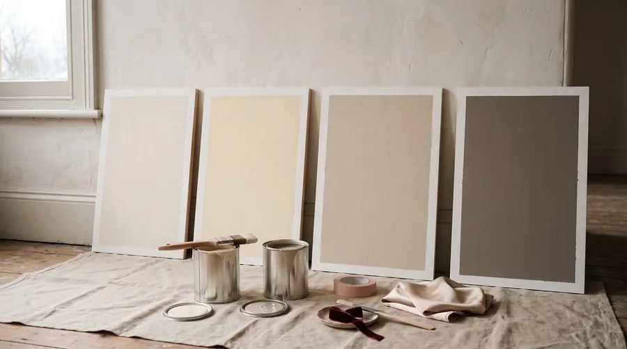
- Buy sample pots and paint boards, not walls. Two coats on A2 pieces of white card or lining paper. Painting patches directly on a wall means the existing colour bleeds through and you cannot move the sample.
- Leave a white margin around each painted board so the colour is not read against the old wall.
- Move the boards around the room and look at them beside the window, on the darkest wall and next to the woodwork.
- Look at three times of day: morning, mid-afternoon and under your lamps at night. A colour that works in all three is the one.
- Live with the shortlist for a week. Colours that irritate you do so by day four, and it is far cheaper to discover that on a board.
Finishes, briefly
Matt for ceilings and for walls in rooms without small children, because it hides imperfections and looks expensive. Eggshell or a modern washable matt for hallways, kitchens and family rooms, where wiping matters. Satin or eggshell on woodwork; full gloss has largely gone out of use except on period joinery, where it is magnificent. Never use a sheen finish on a wall that is not perfectly flat, since gloss shows every ripple.
How much to buy
One litre covers roughly 12 square metres per coat. For a typical 4 by 4 metre room with a 2.4 metre ceiling, that is about 30 square metres of wall, so 2.5 litres per coat and 5 litres for two coats. Always buy the second tin at the same time and check the batch number, since colour varies slightly between batches and running out mid-wall is how a visible line appears.
Try the tool
Room PaletteColour that suits your lightQuestions we get asked
Should a small room be painted white?
Not necessarily. A small room painted a single deep colour including the woodwork reads as intentional and can feel larger than a white box, because there are no contrast lines to measure the space against.
Is expensive paint worth it?
For colour depth and coverage, often yes, since better paint contains more pigment and frequently covers in two coats where cheap paint needs three. For ceilings and rental walls, trade white is perfectly good.
Can I paint over dark colours?
Yes, with a coat of primer or a stain-blocking undercoat first. Skipping it means four coats of finish paint instead of one primer and two.