
Seasonal colour analysis arrived in the 1980s wrapped in a great deal of nonsense and has been quietly rehabilitated since, because the underlying observation is straightforward and testable. Skin, hair and eyes reflect light in a particular range, and fabric held near the face either harmonises with that range or fights it. When it fights, shadows deepen, under-eye circles darken and the face looks tired. When it harmonises, the face looks rested and the garment recedes.
The three variables
Undertone is whether your skin sits warm, with yellow and golden notes, or cool, with pink and blue ones. The reliable test is not the veins on your wrist, which are unreliable in artificial light. Hold a sheet of cream paper and a sheet of optic white paper under your chin in daylight, without make-up. On warm skin, cream makes the face glow and white makes it look grey. On cool skin, white looks clean and cream looks sallow. Roughly one person in five is genuinely neutral and can wear both.
Depth is how light or dark your overall colouring is, taking hair, skin and eyes together. Deep colouring carries strong, saturated shades that would overwhelm a light colouring, which in turn carries soft tints that would vanish on someone deeper.
Contrast is the gap between your hair and your skin. High contrast, such as very dark hair against fair skin, is supported by high-contrast outfits: black with white, navy with ivory. Low contrast, such as light blonde hair with fair skin, is flattered by tonal dressing, and a hard black-and-white combination will look as though it is wearing the person.
A colour that suits you makes people notice your face. A colour that does not makes them notice the garment.
What this means in a shop
Almost every colour exists in a warm and a cool version, which is the practical liberation in all of this. There is a warm red and a cool red, a warm pink and a cool pink, a warm green and a cool green. You are not forbidden a colour; you are looking for its correct version. Cool colouring wants raspberry rather than coral, true red rather than tomato, emerald rather than olive, and silver jewellery rather than yellow gold. Warm colouring wants the reverse in each pair.
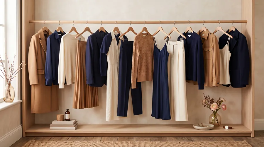
The neutral you choose matters most, because neutrals dominate the expensive half of the wardrobe. Cool colouring is generally best in charcoal, navy, true grey and optic white. Warm colouring comes alive in camel, chocolate, olive and cream. Black is a cool neutral and is a great deal less universal than the fashion industry suggests; on warm or light colouring it often needs a scarf or a necklace between it and the face.
Testing it yourself
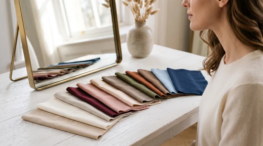
Stand at a north-facing window at midday with no make-up and your hair pushed back. Hold garments one at a time under your chin and watch three things: the shadows under your eyes, the line from nose to mouth, and the colour of the skin itself. The right colours reduce all three. Photograph each one, because the camera notices what the eye argues away.
Our Colour Season tool asks three questions and gives you twelve shades that will work, four to avoid and a printable palette for your phone, which is what you will actually use when you are standing in a shop under fluorescent light.
The one rule that survives everything
If a colour is wrong but you love it, wear it below the waist or put something right between it and your face. A scarf, a collar, a necklace. The system is a tool for looking well, not a rule for looking correct, and any approach to colour that removes joy from getting dressed has been misunderstood.
Try the tool
Colour SeasonThe twelve shades that lift your faceCapsule WardrobeThirty-eight pieces, counted honestlyQuestions we get asked
Does hair dye change my season?
It changes your depth and contrast but not your undertone. Going considerably lighter or darker generally means adjusting how strong your colours are, not whether they are warm or cool.
Can I wear silver and gold together?
Yes, and mixed metals have been standard in fine jewellery for a century. What matters is that the metal touching your face suits your undertone.
Is black really unflattering on some people?
On light and warm colouring it can flatten the face and emphasise shadows. That is solved by a lighter layer at the neckline rather than by avoiding black entirely.